The Arc of the Browser Universe is Long but it Bends Towards Content
After my initial excitement over the Arc browser subsided, I realised that I still liked my tabs on top (hey, don't grin). It's just easier for my eyes to scan them in a familiar movement. I also like to see the full URL in the address bar, which can't really be done elegantly in the sidebar design that Arc uses.
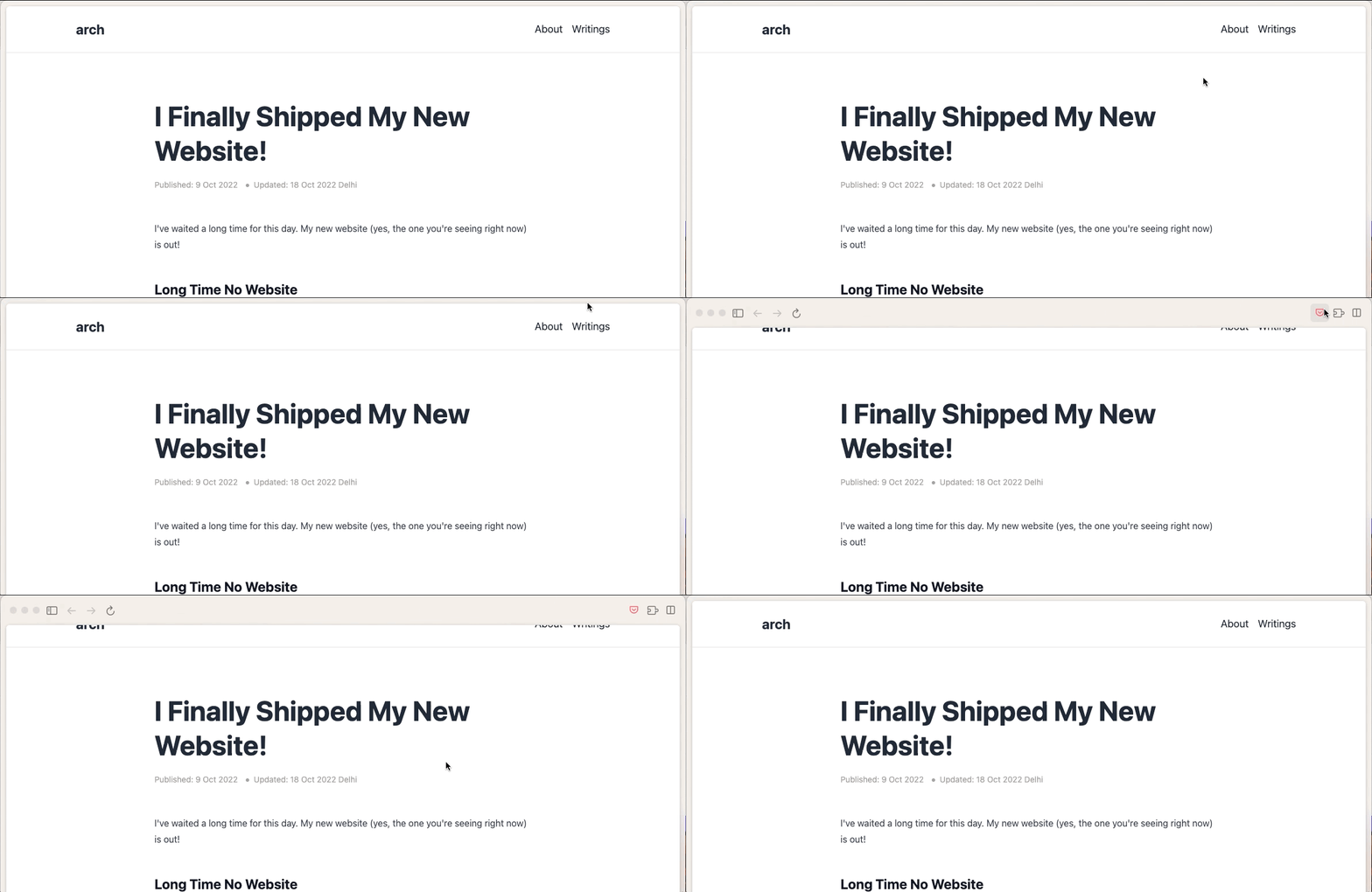
The placement of extensions was also sub-optimal for me. I use Pocket a lot to save articles for later. In Arc, I first had to take the mouse pointer to the top border of the window, wait for it to expand and show the Save to Pocket button and then re-orient my mouse pointer to click on the button. I hate that I can't interact with the button in one single move-and-click mouse motion.

I also figured that no Chromium-based browser can beat my love for Firefox at the moment, even after Proton. I used to worship Google in the good old days, but now I can't bring myself to completely trust anything that they have control over.
That being said, I'm still keeping Arc installed. It looks unbelievably clean and polished. But the biggest benefit by far is the greater real estate to view the webpage. Because of this, the Arc browser has become my go-to Mac app for content consumption. No distractions from reading something deeply. And no need to go full-screen for Netflix any more. 😋